Supra
Rebrand
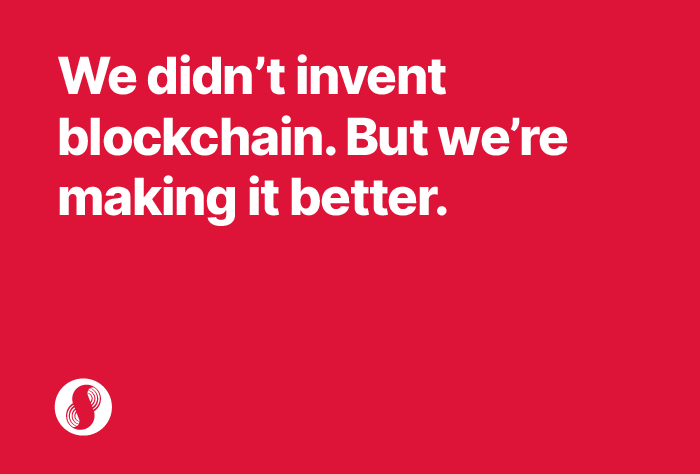
Originally known as SupraOracles, the company’s evolution into a Layer-1 blockchain required a total brand transformation. As Creative Director, my challenge was to pivot the identity from a specialized data tool to a global infrastructure powerhouse. We needed a brand that reflected a “grander vision” of seamless blockchain interoperability—leveling the playing field for all users while maintaining a competitive edge during a high-stakes stealth phase.
Brief: Rebrand to pivot to new name and change in mission and vision
Brand: Supra
Role: Creative Director // Branding, creative direction
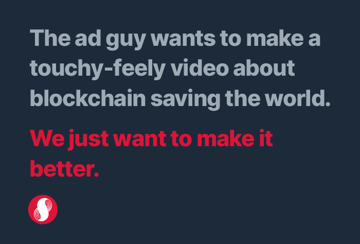
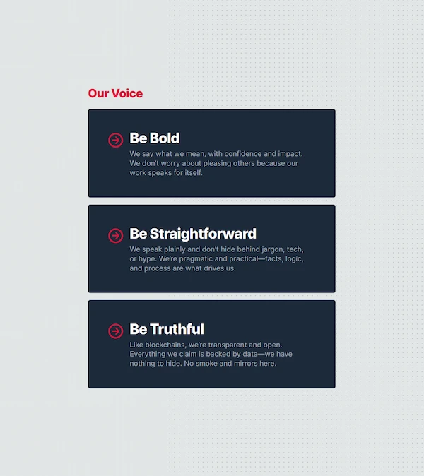
Defining “Better”
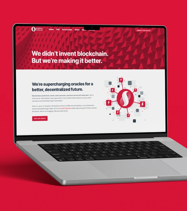
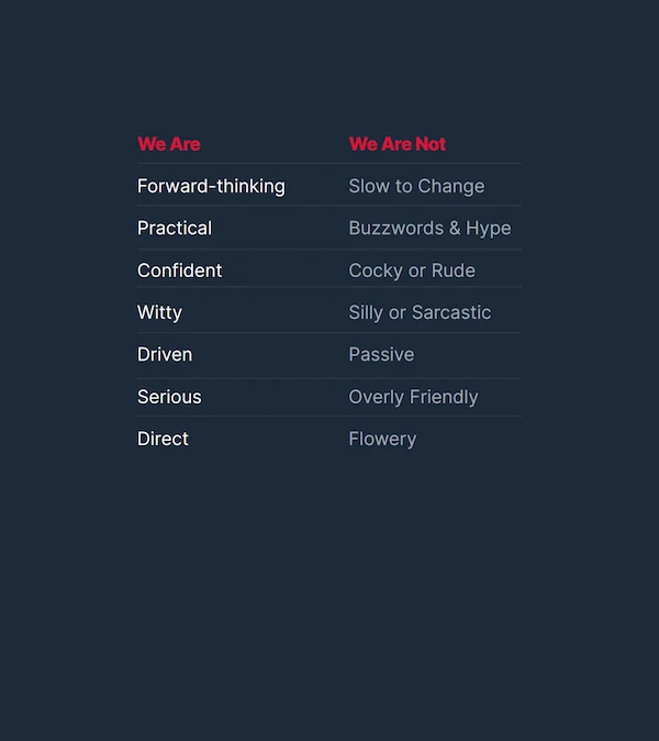
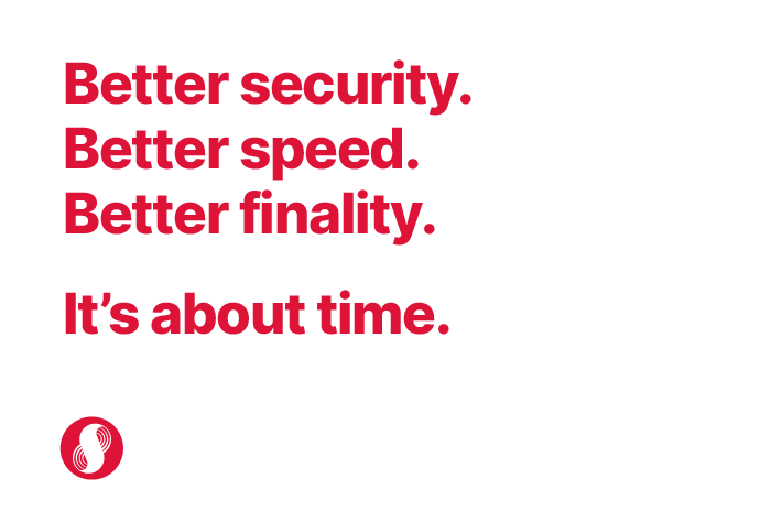
I led a comprehensive branding workshop with key stakeholders to align on a new mission and vision. With the tech still under wraps, we launched a strategic brand campaign centered on a single, provocative word: Better. By associating “Better” with every pillar of the Supra ecosystem—speed, security, and decentralization—we created a bold, easy-to-digest narrative that cut through industry jargon.
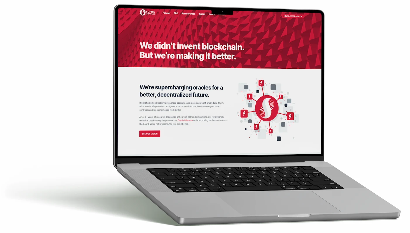
Evolution by Design
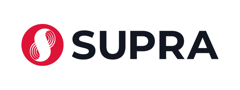
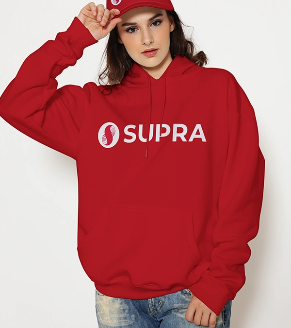
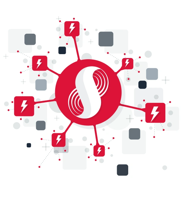
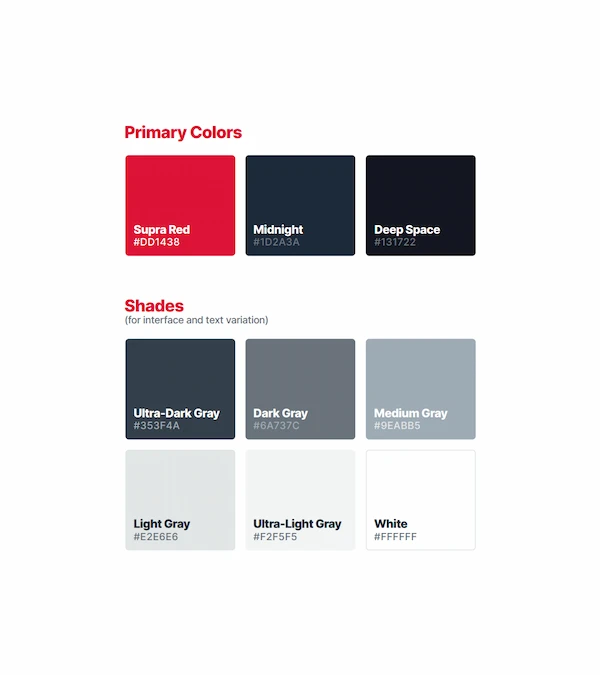
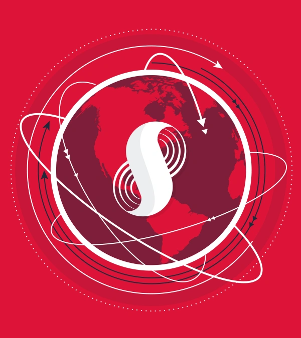
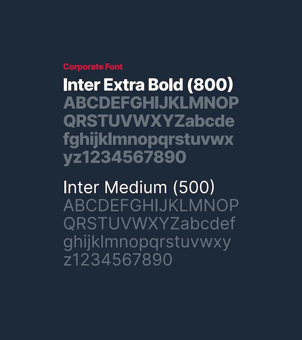
To support this new L1 status, we overhauled the visual identity for maximum impact. We simplified the legacy logo to ensure legibility at micro-scales (essential for dApp integrations) and introduced a bolder, high-contrast color palette. This punchier aesthetic signaled a departure from the “safe” tech look of the past, positioning Supra as a modern, high-performance leader ready to redefine the blockchain landscape.