Igniter
Product Design, UI/UX
How do we get more young people engaged with activism long term, with focused efforts to make a difference and advance their causes?
Brief: Create a gamified app to get activists to complete actions to support causes
Client: Igniter
Role: Branding, Creative Direction, UX, UI

The onboarding screens were created with minimal illustrations with a limited color palette
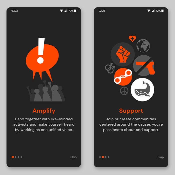
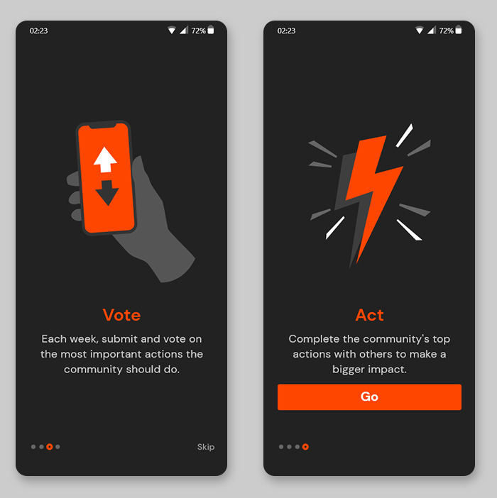
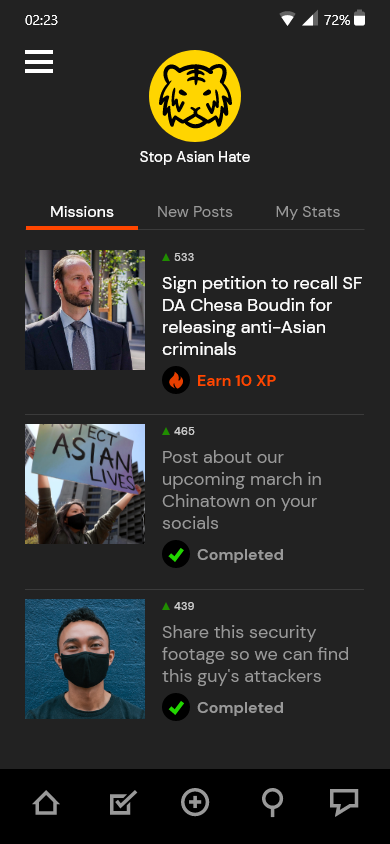
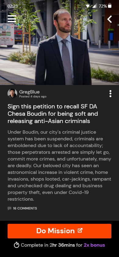
How it works: First you join a community built around a cause you support. Then post actions you think helps advance the movement—like sign a petition, share an article, twitter bomb someone etc. The community will then vote and rank on the most important actions. The top actions will be become ‘missions’ and blasted to the community to complete.
Priorities First
Many activists we spoke to expressed frustrations around how communities on their social networks always seemed divided or at least unfocused when deciding how and what to act on. They have communities with thousands of members but only a few go beyond commenting to actually engage where it counts most.
One of the core ideas of Igniter is that each post is voted on and ranked by the community as the most important action to take right now. This allows the best posts to naturally bubble up, and the top ranked posts become ‘missions’ for the community to complete. This process filters out the best from the noise and focuses all the energy on what’s important to make a real change.
Making it Gamified
When we started this project, a lot of older experienced organizers felt that there was a lot of energy from younger users and it wasn’t difficult to get them interested in activism but keeping them engaged long term was the challenge. Our approach was to add a gamification layer to constantly reward and encourage more participation and engagement.
One of the important UI decisions was to balance the gamification elements with the seriousness of the causes. We did not want it to look like a flippant game, but to take best practices of game design principles by focusing the user’s attention on exactly what needs to be done next to move forward in the game—in this case, let them know how many missions are left to complete in the most simple and direct interface as possible.
Band together with other activists to complete ‘missions’ that the community ranks as most important to the cause.
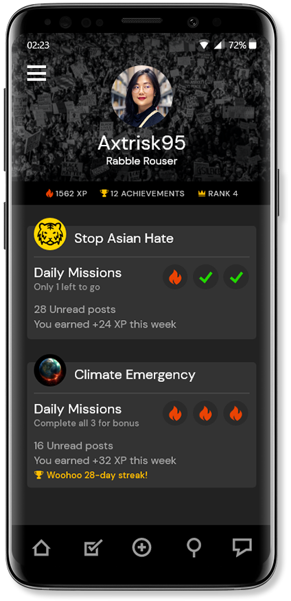
1. Dashboard: The user immediately sees the tasks that need to be taken—she is in two communities and needs to complete complete four missions.
2. Cause Landing: the emphasis is completing the three daily missions. Tabs on top indicate new posts and engagement stats with this community.
3. Mission Page: Once the user taps into the mission, the details and presented on why it’s important and then a large CTA to complete the mission.