Qudrop
Brand Identity
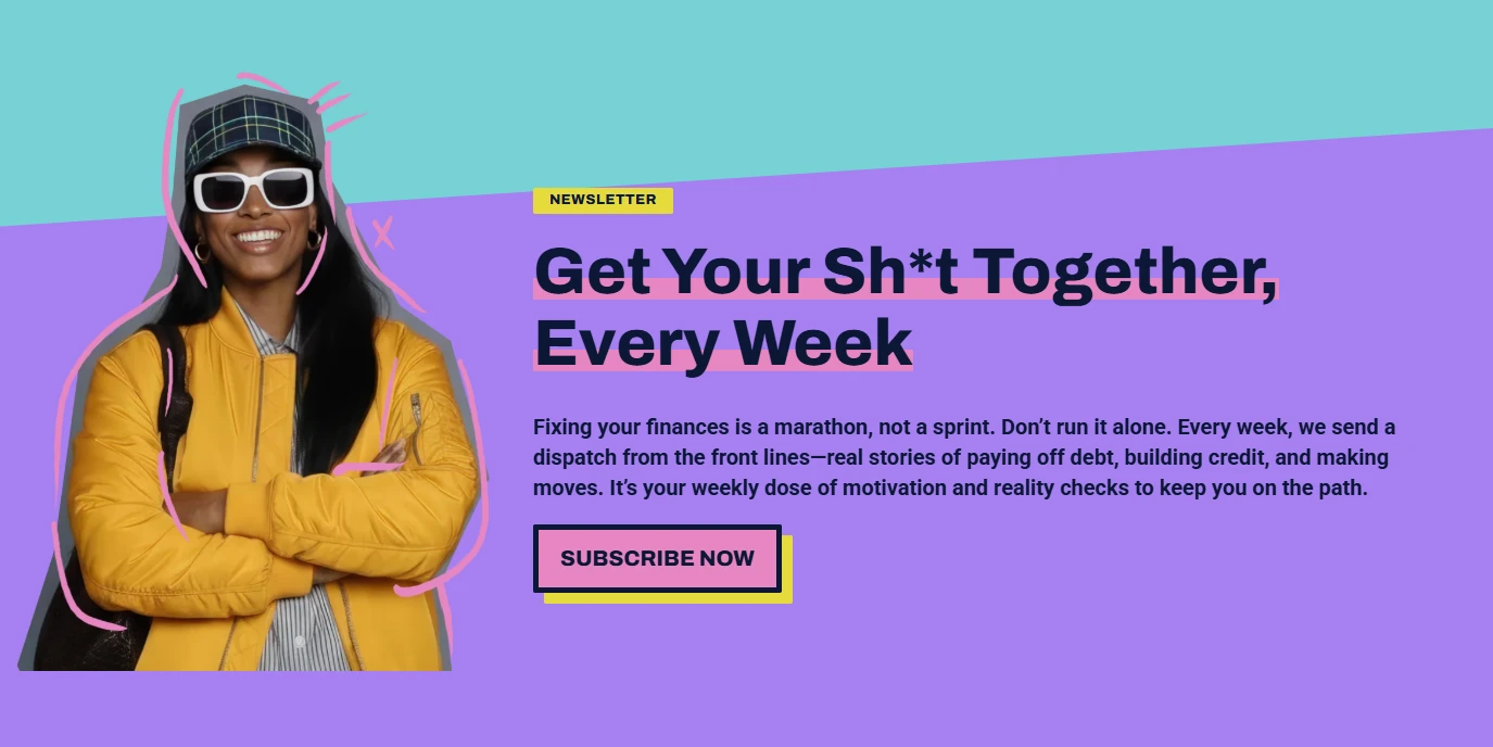
Adulthood brings high-stakes financial choices, yet most resources feel gatekept or condescending to young, urban students. Our challenge was to build Qudrop: a digital home for “adulting” that stripped away the stuffy institutional tone. We developed a brand that acts as a trusted, informed peer—balancing the authority needed for financial advice with a visual language that resonates with an audience wary of traditional banking.
Brief: Create brand identity, product designs and launch the ecommerce shop.
Client: Qudrop
Role: Branding, art direction, design, UX, site design, WordPress


A “Feed First” Visual Identity
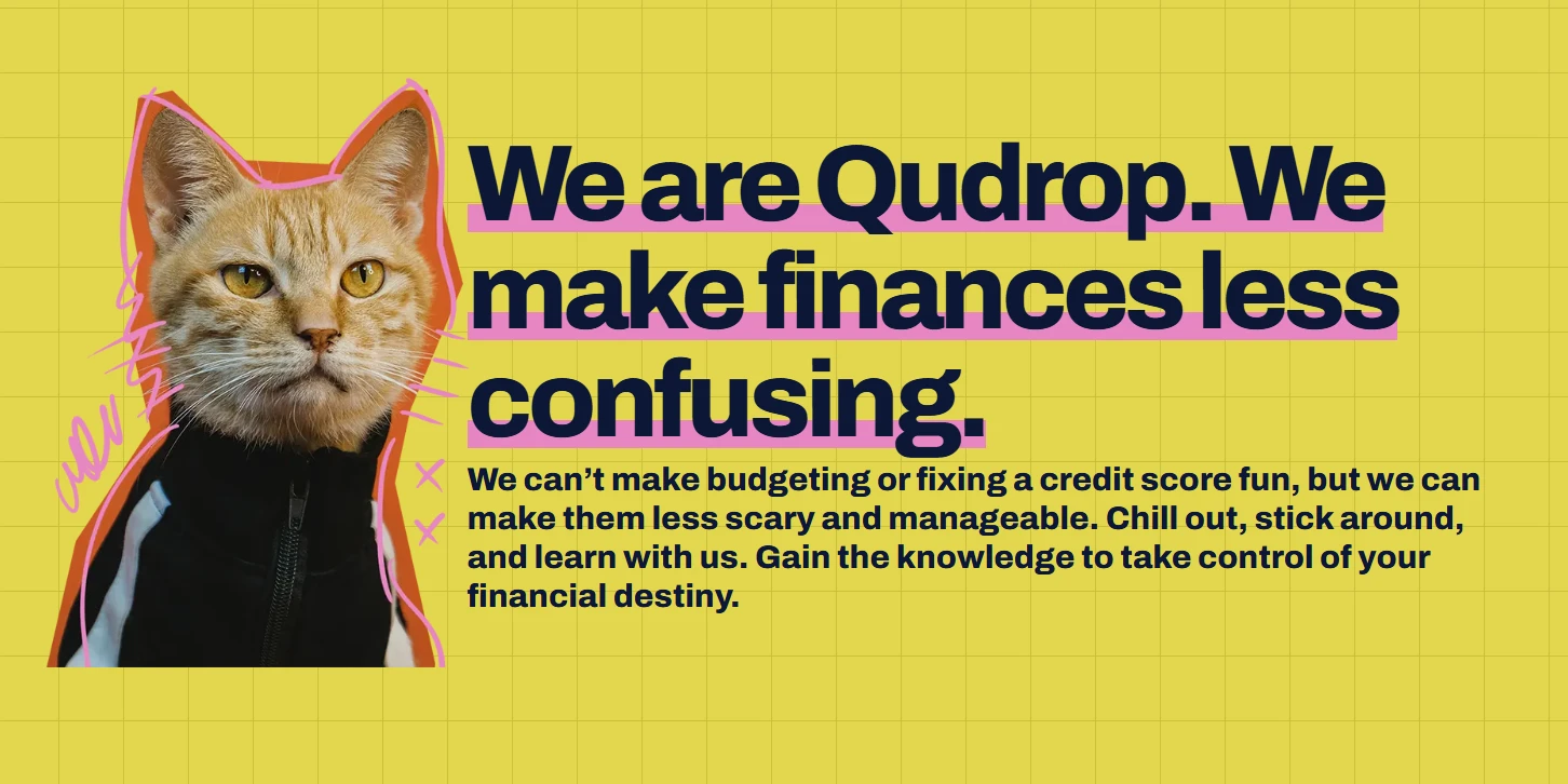
We didn’t just design a website; we built a holistic brand system from the ground up. Utilizing the Feed First framework, we developed the visual language and social media playbook simultaneously to ensure the brand felt native to TikTok and Instagram. This meant prioritizing bold typography, high-energy motion, and a “thumb-stopping” aesthetic that translated seamlessly from a formal educational platform to a quick-hitting social post.


Building Trust Through Voice
The heart of Qudrop’s success lay in its specific tone of voice. We moved away from financial jargon in favor of direct, transparent, and urban-centric communication. By pairing this authentic voice with a professional, robust UI, we established a sense of “relatable authority.” The result was a brand that didn’t just give advice—it built a community where young adults felt seen, respected, and empowered to take control of their financial futures.

Financial literacy isn’t a lecture; it’s an invitation. We built Qudrop to be the relatable authority for a generation rewriting the rules of adulting.