Razer
In-house Corporate Rebrand
Razer began in 2006 and developed a cult-like following by being unapologetically made for gamers, by gamers. Over the years, as the company matured and gaming became mainstream, the old aggro aesthetic was looking dated and didn’t represent the attitude and values of the company anymore.
Brief: Update the Razer identity to be contemporary and reflect the evolved attitude and values of the brand
Brand: Razer
Role: Global Design Director // Branding, Creative Direction
Don’t touch the snakes
At the start of the project, we knew that gamers and our fans loved the snakes logo (some even got tattoos of it). So the challenge of the rebranding effort was to update the feel of the brand but just don’t touch the snakes logo.
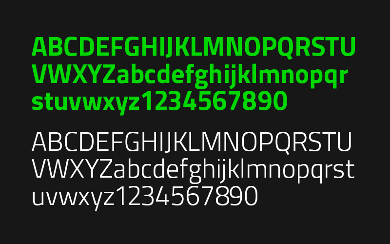
The wordmark was the most drastic change as we erased all reference to the past of the ‘distressed’ logo, opting for a clean angular sci-fi-inspired logo. This coincided with the updated tone-of-voice. Instead of bragging about headshots and pwning your opponent, Razer’s tone and language shifted to premium performance.
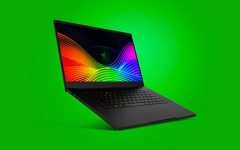
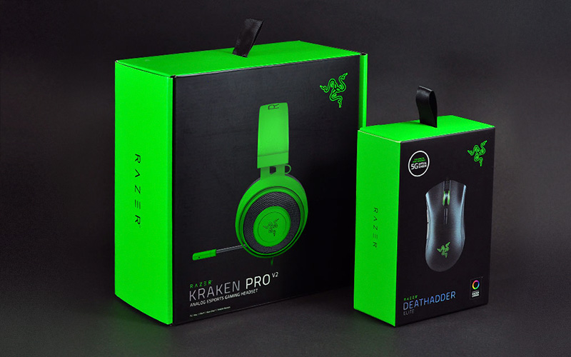
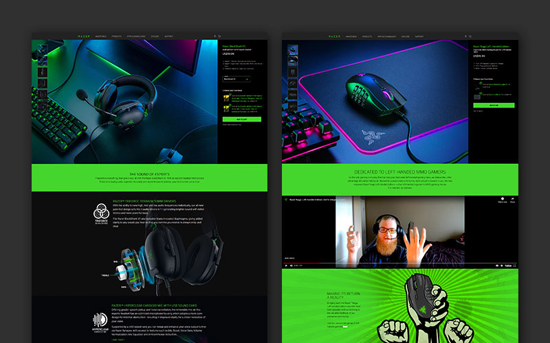
Going all in on green
In the gaming industry, the major players all have a dominant corporate color (for example Logitech is blue, Corsair is yellow). This self segmentation just happened for gaming brands and gamers will even refer to brand by color, like “I’m for team green”.
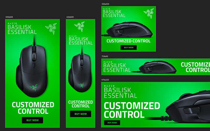
While Razer ‘owned’ the black and green amongst the major gaming companies, we were primarily a lot of black on black. In the rebranding effort we went all in on green, making it a much stronger design element than before. Working in this bright green helped make retail displays pop and provide a bright background for the black products to sit on on banners.
The rebranding was company-wide and affected all designs across the board as we updated packaging, website, display ads, point-of-sale materials, in-store retail displays and even our in-house iconography.